data from 538.com with altair#
download the zip
to run this code on your own laptop,
start with downloading the zip file
import pandas as pd
import matplotlib.pyplot as plt

import geopandas as gpd

# activate this if running under jlab
# %matplotlib ipympl
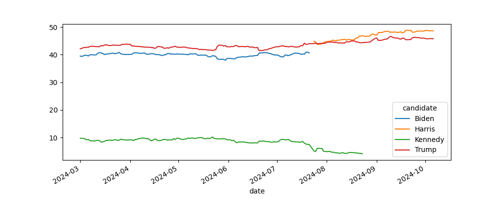
presidential averages#
538.com - actually it is http://fivethirtyeight.com - is a site hosted by ABC news, that exposes data about the US presidential election
we’re gonna use the data in this URL:
URL = "https://projects.fivethirtyeight.com/polls/data/presidential_general_averages.csv"
update 2025
initially we would have written a function that loads this URL; it would
cache it on your hard drive so you can reload it faster
do any type conversion that you see fit
as of 2025 this URL is no longer online so we’ll just
load the data from
data/DATA.csvstill be careful about the columns types
# your code

CACHE = "data/DATA.csv"
And what we want to do is to plot the average of the polls for each candidate.
In other words, you should obtain something like this - we will arbitrarily focus on the 2024 year only
# your code
using the interactive view (after all we are using %matplotlib ipympl), zoom into the figure and retrieve
the date for the last data about Joe Biden
the date for the first data about Kamala Harris
also write a line of code to compute this second date
# your code

first_harris_date = ...
race end#
from this part we will focus on the period after first_harris_date
# your code
how many candidates are still in the data ?
make sure to keep only the 2 most famous ones
# your code
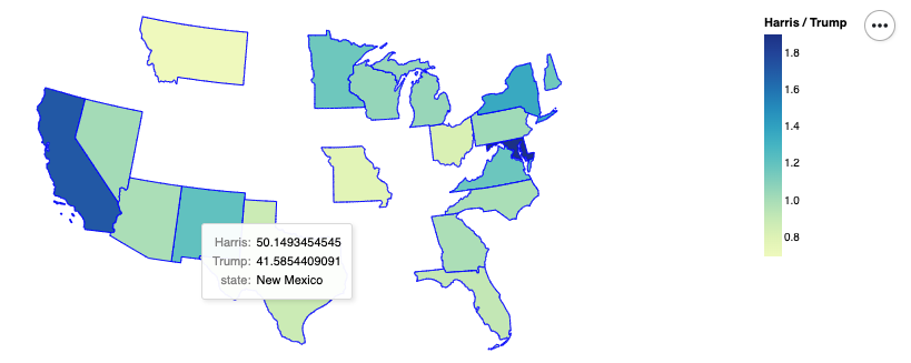
geographic rendering#
in this section we will produce a summary map, which looks like this
the color depicts the ratio between, otoh Harris’s average score over time, and otoh Trump’s
also the tooltips allow to expose more details on the individual results
first we need a definition of the various US states; there is one here
update 2025
here again, there’s been a change since 2024: this URL no longer comes with a valid SSL certificate
so we’ll use the version stored under data/ again
# no longer easily readable by geopandas because of an SSL certificate issue
US_STATES_SHAPEFILE_URL = "https://www2.census.gov/geo/tiger/GENZ2018/shp/cb_2018_us_state_20m.zip"

US_STATES_SHAPEFILE_CACHE = "data/us-states.zip"
and we can load it like so:
# so instead of doing this
# gdf = gpd.read_file(US_STATES_SHAPEFILE_URL)

# we'll do this
gdf = gpd.read_file(US_STATES_SHAPEFILE_CACHE)

# and we get this
gdf.head()
| STATEFP | STATENS | AFFGEOID | GEOID | STUSPS | NAME | LSAD | ALAND | AWATER | geometry | |
|---|---|---|---|---|---|---|---|---|---|---|
| 0 | 24 | 01714934 | 0400000US24 | 24 | MD | Maryland | 00 | 25151100280 | 6979966958 | MULTIPOLYGON (((-76.04621 38.02553, -76.00734 ... |
| 1 | 19 | 01779785 | 0400000US19 | 19 | IA | Iowa | 00 | 144661267977 | 1084180812 | POLYGON ((-96.62187 42.77926, -96.57794 42.827... |
| 2 | 10 | 01779781 | 0400000US10 | 10 | DE | Delaware | 00 | 5045925646 | 1399985648 | POLYGON ((-75.77379 39.7222, -75.75323 39.7579... |
| 3 | 39 | 01085497 | 0400000US39 | 39 | OH | Ohio | 00 | 105828882568 | 10268850702 | MULTIPOLYGON (((-82.86334 41.69369, -82.82572 ... |
| 4 | 42 | 01779798 | 0400000US42 | 42 | PA | Pennsylvania | 00 | 115884442321 | 3394589990 | POLYGON ((-80.51989 40.90666, -80.51964 40.987... |
so as you can see this is almost like a regular dataframe, except for the geometry column; which is a geographic entity, hence the term geo-dataframe
digression 2: using altair to produce a geographic visualization#
of course you might have to install altair… how do you go about doing that again ?
see also
more details on this topic can be found here:
import altair as alt

# this is for rendering altair charts within the notebook
alt.renderers.enable("html")
RendererRegistry.enable('html')
# to show a geographic map from that geo-df

alt.Chart(gdf).mark_geoshape()
# or we can also use it like this if we prefer

chart = (
    alt.Chart(gdf)
    .mark_geoshape()
)

chart.display()
now in terms of presentation, it is a little suboptimal, let’s improve this a bit
(
    alt.Chart(gdf)
    .mark_geoshape()
    .properties(width=800)
    .project('albersUsa')
)
now, the initial geo-dataframe has some numeric values, that we can use to color the map !
for example, there are AWATER and ALAND - that I take it mean area of water and area of land respectively
and we can use one of these to color the different states
for that we just do, like for simpler altair plots we call encode() like so
(
    alt.Chart(gdf)
    .mark_geoshape()
    .encode(
        color="ALAND:Q",          # Q stands for quantitative
    )
    .properties(width=800)
    .project('albersUsa')
)
# or if we prefer, same result essentially
# but this way we can be more descriptive

(
    alt.Chart(gdf)
    .mark_geoshape()
    .encode(
        color=alt.Color(field="ALAND", type="quantitative", title="land area")
    )
    .properties(width=800)
    .project('albersUsa')
)
# also useful with altair, we can give a `tooltip` parameter to encode
# and this shows when your mouse hovers on a state

(
    alt.Chart(gdf)
    .mark_geoshape()
    .encode(
        color=alt.Color(field="AWATER", type="quantitative", title="water area"),
        # and we can show there anything from the table
        tooltip=["NAME", "ALAND"],
    )
    .properties(width=800)
    .project('albersUsa')
)
back to our data#
given this knowledge, you should be able to produce our target graph, namely again
# your code
focusing on swing states#
from the graph above, keep only the following states
hint
the method pd.Series.isin() might come in handy for this step
SWING_STATES = [
    'Nevada',
    'Arizona',
    'Wisconsin',
    'Michigan',
    'Pennsylvania',
    'Georgia',
    'North Carolina',
]
# your code