grouping through time and category#
download the zip
to work on this assignment locally on your laptop, start with downloading the zip
in this TP we work on
data that represents periods and not just one timestamp
checking for overlaps
grouping by time
later grouping by time and category
and some simple visualization tools
here’s an example of the outputs we will obtain
imports#
import pandas as pd
import matplotlib.pyplot as plt
make sure to use matplotlib in interactive mode - aka
ipympl
# your code
the data#
we have a table of events, each with a begin and end time; in addition each is attached to a country
leases = pd.read_csv("data/leases.csv")
leases.head(10)
| beg | end | country | |
|---|---|---|---|
| 0 | 2016-12-28 13:00:00 | 2016-12-28 16:00:00.000 | Syria |
| 1 | 2016-11-09 18:00:00 | 2016-11-09 20:00:00.000 | Syria |
| 2 | 2016-02-26 21:00:00 | 2016-02-26 22:00:00.000 | Syria |
| 3 | 2017-06-26 19:10:00 | 2017-06-26 19:30:00.000 | Syria |
| 4 | 2017-02-01 04:00:00 | 2017-02-01 05:00:00.000 | Argentina |
| 5 | 2016-02-03 14:00:00 | 2016-02-03 15:00:00.000 | Syria |
| 6 | 2016-09-01 09:00:00 | 2016-09-01 10:00:00.000 | Tunisia |
| 7 | 2017-12-13 19:00:00 | 2017-12-13 21:00:00.000 | Somalia |
| 8 | 2017-01-06 15:00:00 | 2017-01-06 16:00:00.000 | Lesotho |
| 9 | 2017-03-09 13:00:00 | 2017-03-09 16:00:00.000 | Rwanda |
adapt the type of each columns#
# your code
# check it

leases.dtypes
beg        object
end        object
country    object
dtype: object
raincheck#
check that the data is well-formed, i.e. the end timestamp happens after beg
# your code
are there any overlapping events ?#
it turns out there are no event overlap, but write a code that checks that this is true
note
nothing in the rest depends on this question, so if you find this too hard, you can skip to the next question
# your code
timespan#
What is the timespan coverred by the dataset (earliest and latest events, and duration in-between) ?
# your code
aggregated duration#
so, given that there is no overlap, we can assume this corresponds to “reservations” attached to a unique resource (hence the term lease)
write a code that computes the overall reservation time, as well as the average usage ratio over the active period
# your code
visualization - grouping by time only#
usage by period#
grouping by periods: by week, by month or by year, display the total usage in that period
(when ambiguous, use the beg column to determine if a lease is in a period or the other)
for now, just get the grouping right, we’ll improve miscellaneous details below
also you can refer to this section below to get a glimpse of the expected output, even though for now we have no grouping, so a single color for all bars.
# your code
improve the title and bottom ticks#
add a title to your visualisations
also, and particularly relevant in the case of the per-week visu, we don’t get to read the labels on the horizontal axis, because there are too many of them
to improve this, you can use matplotlib’s set_xticks() function; you can either figure out by yourself, or read the few tips below
a few tips
the object that receives the
set_xticks()method is an instance ofAxes(one X&Y axes system),
which is not the figure itself (a figure may contain several Axes)
ask google or chatgpt to find the way you can spot theAxesinstance in your figureit is not that clear in the docs, but all you need to do is to pass
set_xticksa list of indices (integers)
i.e. if you have, say, a hundred bars, you could pass[0, 10, 20, ..., 100]and you will end up with one tick every 10 bars.there are also means to use smaller fonts, which may help see more relevant info
# let's say as arule of thumb
LEGEND = {
    'W': "week",
    'M': "month",
    'Y': "year",
}

SPACES = {
    'W': 12,   # in the per-week visu, show one tick every 12 - so about one every 3 months
    'M': 3,    # one every 3 months
    'Y': 1,    # on all years
}
# your code
a function to convert to hours#
write a function that converts a timedelta into a number of hours - see the test code for the details of what is expected
# your code

def convert_timedelta_to_hours(timedelta):
    pass
# test it

# if an hour has started even by one second, it is counted
# seconds, hours
test_cases = (
    (0, 0),
    (1, 1), (3600, 1),
    (3601, 2), (7199, 2), (7200, 2),
    (7201, 3), (pd.Timedelta(3, 'h') + pd.Timedelta(2, 'm'), 4),
    (pd.Timedelta(2, 'D'), 48),
)

def test_convert_timedelta_to_hours():
    for seconds, exp in test_cases:
        if not isinstance(seconds, pd.Timedelta):
            timedelta = pd.Timedelta(seconds=seconds)
        else:
            timedelta = seconds
        got = convert_timedelta_to_hours(timedelta)
        print(f"with {timedelta=} we get {got} and expected {exp} -> {got == exp}")

test_convert_timedelta_to_hours()
with timedelta=Timedelta('0 days 00:00:00') we get None and expected 0 -> False
with timedelta=Timedelta('0 days 00:00:01') we get None and expected 1 -> False
with timedelta=Timedelta('0 days 01:00:00') we get None and expected 1 -> False
with timedelta=Timedelta('0 days 01:00:01') we get None and expected 2 -> False
with timedelta=Timedelta('0 days 01:59:59') we get None and expected 2 -> False
with timedelta=Timedelta('0 days 02:00:00') we get None and expected 2 -> False
with timedelta=Timedelta('0 days 02:00:01') we get None and expected 3 -> False
with timedelta=Timedelta('0 days 03:02:00') we get None and expected 4 -> False
with timedelta=Timedelta('2 days 00:00:00') we get None and expected 48 -> False
convert_timedelta_to_hours(pd.Timedelta(2, 'D'))
use it to display totals in hours#
keep the same visu, but display the Y axis in hours
btw, what was the unit in the graphs above ?
# your code
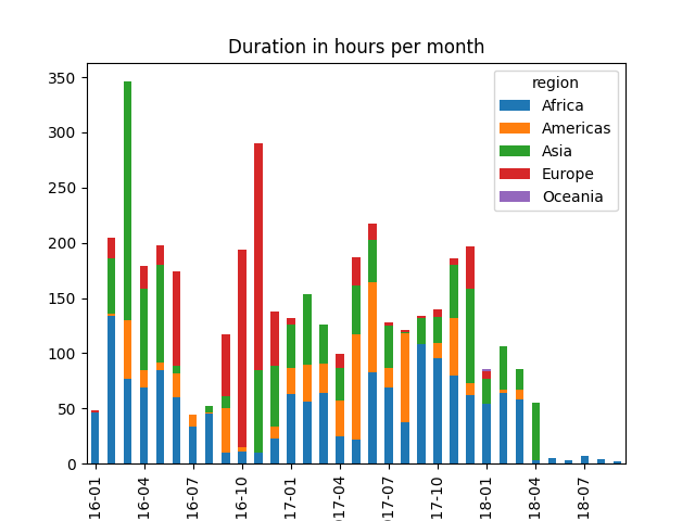
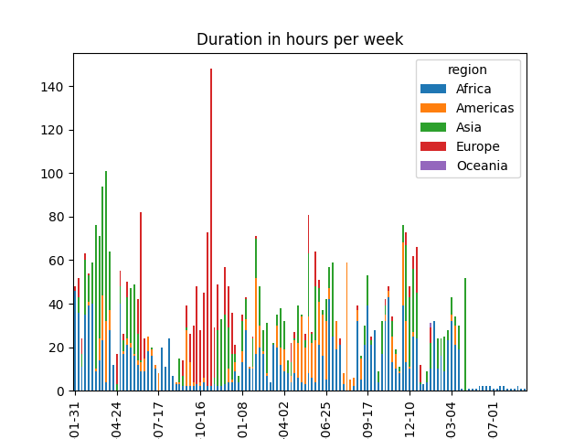
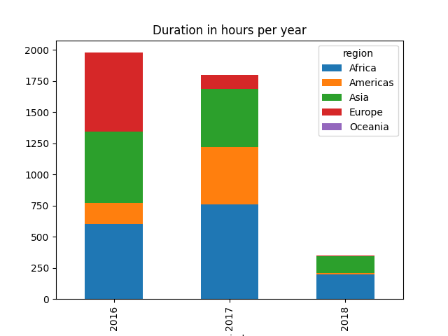
grouping by time and by region#
the following table allows you to map each country into a region
# load it

countries = pd.read_csv("data/countries.csv")
countries.head(3)
| name | region | |
|---|---|---|
| 0 | Rwanda | Africa |
| 1 | Jersey | Europe |
| 2 | Syria | Asia |
# how many countries ?

countries.region.value_counts()
region
Africa      10
Asia         9
Europe       6
Americas     5
Oceania      1
Name: count, dtype: int64
that is to say, 5 groups (at most)
your mission is to now show the same graphs, but with each bar split into up to 5, to reflect the relative usage of each region
attach a region to each lease#
most likely your first move is to tag all leases with a region column
# your code
visu by time and by region#
you can now produce the target figures; the expected final results looks like this
# your code